@2026 VCLA Media


Client
MetCentre, JLL
strategy
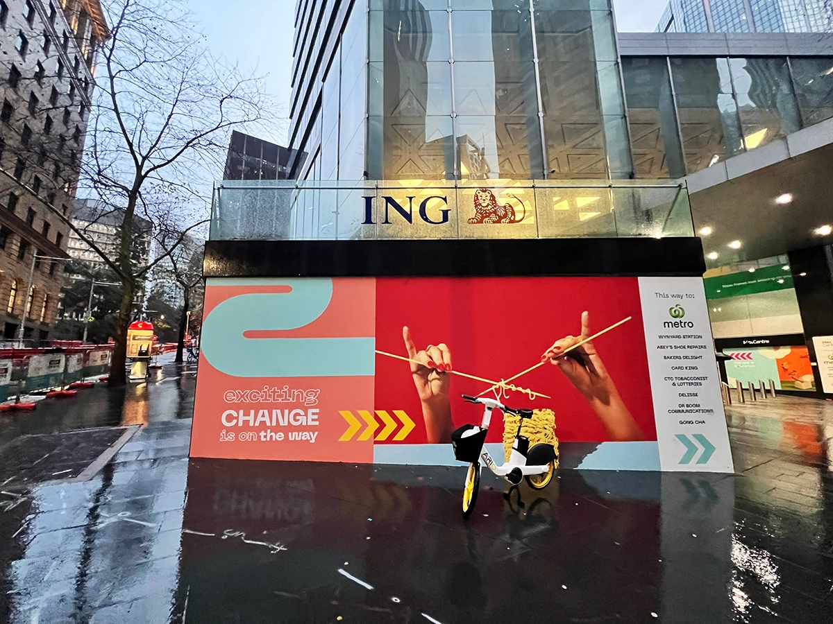
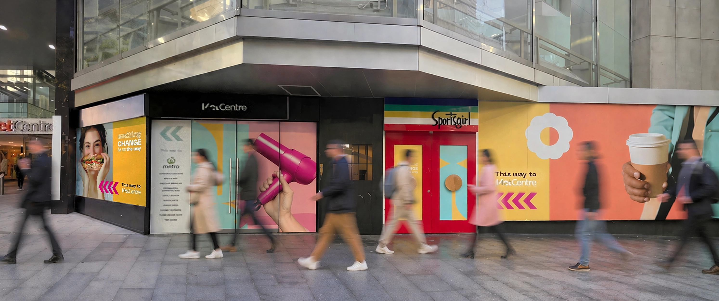
Transition messaging
Positive visual disruption
identity
Surreal photography
Food-led cues
experience
Street-level engagement
Visual storytelling
activation
Window hoarding design
Large format rollout

Outcome
The space stayed active, not empty. Instead of reading as a vacancy, the windows became a point of interest, holding attention in a high-traffic part of the city, keeping the centre present in people’s daily routine.
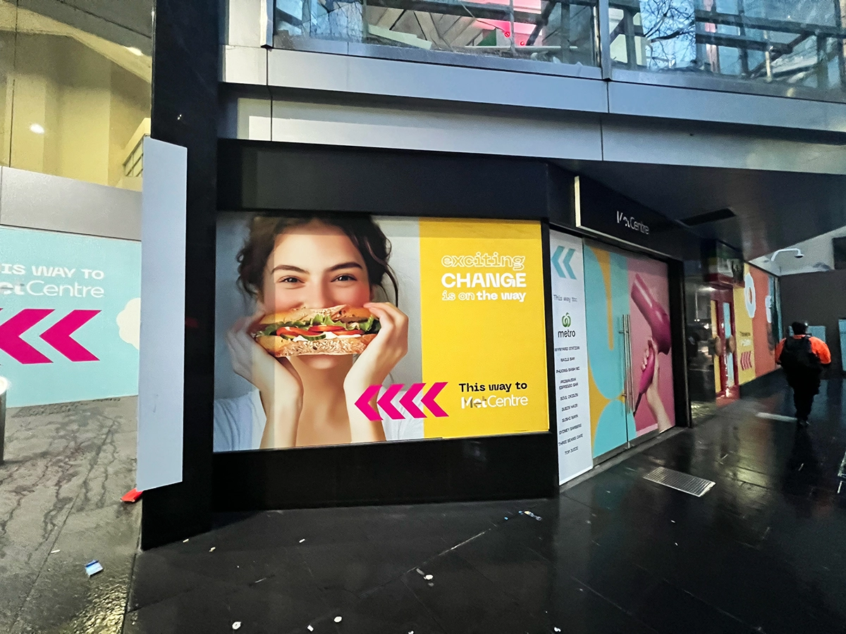
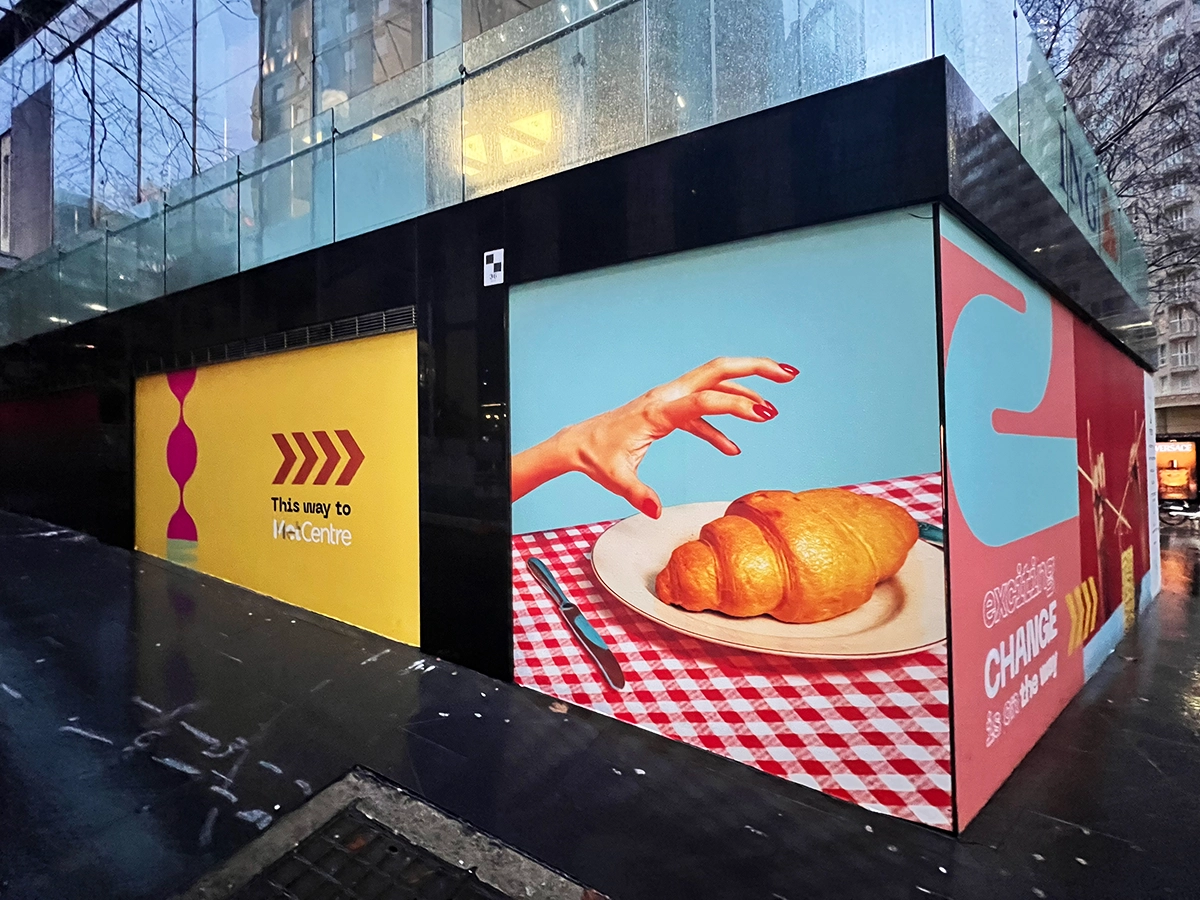
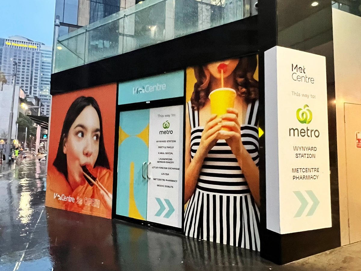
More importantly, it reinforced that MetCentre was still open and evolving, maintaining relevance during a period where it could have easily been overlooked.